Color Psychology: Designing Your Stickers For Maximum Impact
Custom stickers are a popular and effective marketing tool for many businesses. They can be used to promote your brand, spread awareness about a cause or event, or as giveaways at events like trade shows.
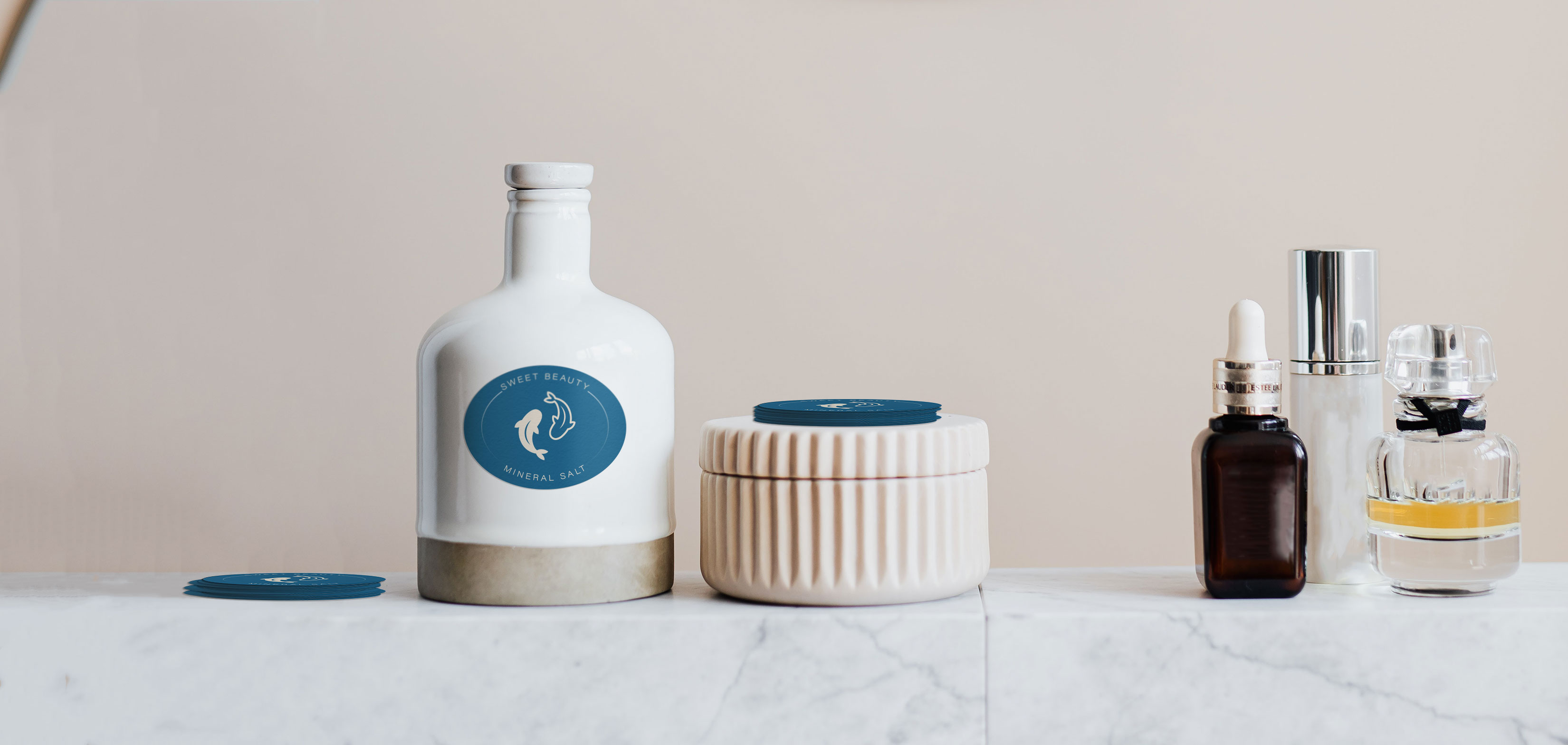
Sticker printing is an exciting process that comes with the opportunity to let your creativity run free. One thing you might not have considered when designing stickers and labels, however, is color psychology.
This article explores how our brains work differently with certain colors, what this means for your custom sticker designs, and a few tips to get you started.
What Is Color Psychology?
Color psychology is the branch of study that investigates how colors influence human behaviors and emotions.
In marketing, it is important to understand how different colors impact consumer behaviors. Marketing experts have found that many people make judgments about products and services based on the colors used to market them.
Color psychology is a popular topic these days, and for good reason. Big brands like Apple and Starbucks have been using it for years to tap into their audiences' emotions. Small business owners can benefit too, and when it comes to designing stickers and labels, color is an important factor to consider.
Designing Stickers With Color Psychology In Mind
Sticker designs can be particularly effective when they take into account what psychological effect different colors have on people's mindsets, opinions, and purchasing decisions. This knowledge can help small business owners to stand out in a sea of online competition by creating custom stickers and labels that speak directly to their target customers.
Let's take a look at some of the most popular colors, how they impact our behaviors and how you can use them to enhance your sticker designs...
- Red - This is often considered to be one of the more aggressive colors because it conveys feelings such as urgency or passion. Red is a very physically intense color that is associated with energy and vigor. It increases people's hunger levels, so it can be a good choice for food or drink businesses - especially if they are targeting younger demographics.
- Orange - This vibrant hue has been shown to make people feel more optimistic about their surroundings, increasing happiness and excitement.
- Yellow - This bright hue tends to make people feel more optimistic and cheerful. Yellow conveys the feeling of happiness without the energy boost associated with red, making it a good option if you're looking for something more relaxing.
- Green - Green is often associated with nature and the outdoors, so it can tap into people's environmental concerns in addition to bringing about feelings of calmness and serenity.
- Blue - Blue conveys a sense of dependability or trustworthiness, which makes it an ideal choice if you are trying to convey your business as a safe, secure option.
- Purple - Purple is known to convey luxury and sophistication, making it an excellent choice for those looking to project their business as high-end or luxurious.
- Pink - Pink has been shown in studies to increase people's levels of generosity and empathy because the color stimulates our nurturing side. This makes pink a great choice for those looking to convey a nurturing image.
- Black - While black is often considered one of the more sinister colors, it can also be seen as professional and elegant. It's not an ideal color if you're trying to create a fun or child-friendly product, but it works well with adult products such as luxury items like high-end clothing or accessories.
- White - White is often associated with purity, cleanliness, and neutrality, making it an excellent choice when you're trying to convey a simple or minimalistic image for your product.
- Brown - Brown has been shown in studies to increase people's levels of relaxation, making it ideal if you're looking to create products that make consumers feel at home and cozy.
Tips To Get You Started
When creating stickers for your business, you should consider how different hues communicate specific emotions and feelings that customers might attach themselves to as they interact with your designs.
Here are just a few tips to get you started...
1. Match your color to your message
It's important that stickers are eye-catching and appealing to potential customers. Stickers are a great way to promote your business, but remember that the design is just as important as the message. Color sets the tone of your message, so it's important to choose the right colors when designing your stickers or packaging labels.
If you're selling children's toys, for example, bright and vibrant colors will help convey a sense of fun. If you sell items in the health industry such as vitamins or supplements, it might be best to use calming tones that evoke a feeling of balance and wellness.
2. Stick with one or two colors
Have you ever noticed that big companies and brands use a limited range of colors in their branding? From the famous Coca-Cola red to Facebook blue, many popular products and services have chosen just a handful of complementary colors. This is because we tend to prefer simplicity over complexity when it comes to our visual processing.
If you want to design stickers that will leave a lasting impression, don't overwhelm your customers with too many colors at once!
3. Choose colors that complement each other
As well as sticking with a limited number of colors for your stickers, you should also consider how different hues work together in combination. Certain pairs go better together than others - warmer tones such as yellow and red work well together. In contrast, cool tones such as blue and purple can create a more calming effect.
If you're looking for inspiration on how to match your chosen colors with each other - why not check out some of the popular color schemes that have been used by brands in the past?
Conclusion
Stickers that use color psychology can help customers connect with what they're seeing and make a positive impact on their emotions. Having a basic understanding of the concept is an excellent starting point when it comes to designing stickers that will get the reaction you're looking for from your customers.
Hopefully, you’re now feeling inspired to get creative with your sticker designs while using color psychology to your advantage. What colors will you use?
Let us know in the comments, and as always, if you need help with your custom sticker printing and design, be sure to get in touch.
Recent Posts
- Five Creative Ideas for Using Christmas Stickers in Your Business
- Say It with Stickers: Five Fun Ideas for the Holiday Season
- 5 Top Tips for Designing Stickers Kids Will Love
- Color Psychology: Designing Your Stickers For Maximum Impact
- Selling Stickers On Etsy – Part 2
- Selling Stickers On Etsy - Part 1
- 'Pimp My Ride': 5 Benefits of Vehicle Graphics for Small Business Owners
- Get Noticed: 5 Benefits of Window Graphics for Your Business
- The Ultimate Checklist to Creating Online Buzz for Your Next Event: 17 Ways Stickers Get it Done
- 5 Ways E-Commerce Packaging Can Enhance Your Customer Experience
- Stickers - A Must-Have Marketing Tool for Your Next Hackathon or Tech Event
- Using Stickers to Connect with Your Audience: The Ultimate Marketing Tool For Musicians and Festivals Everywhere
- The Insider's Guide to Beer Bottle Label Design: Custom Labels to Build Your Brand
- 7 Mistakes to Avoid When Designing and Ordering Stickers
- How To Grow Your Business and Boost Your Brand with Custom Stickers
- Custom Beer Labels printed by Label Llama
- What is the difference between die cut and kiss cut stickers?
- Custom Social Distancing Stickers
Upload your artwork
Safe Life - Keep all essential art away from the edge of the label at least 1/16
Die Line - Anything past this line will get cut off
Outside Bleed - Any art that reaches the edge of the labels MUST bleed at least 1/8" past the die line.